Contents
Topics covered in this guide:
-
Overview
Explore the introduction to Sticky Notes, with advanced features that elevate ticket management within Zendesk. -
Installation
Learn how to install Sticky Notes from the Zendesk Marketplace, set up multiple instances, configure settings, and manage app access. -
Quick Start configuration
Begin by configuring the Quick Start settings efficiently. -
Global settings
Define the core functionalities and default behaviors that apply across the entire Sticky Notes application. -
Location settings
Set the display location for Sticky Notes, then modify location preferences for a tailored and streamlined workspace. -
Logged notes
Create timestamped and agent-attributed notes with customizable editing permissions. -
Pinned comments
Pin and highlight important ticket comments and side conversations to prevent loss in lengthy threads. -
Zendesk fields
Leverage Zendesk fields to store the data agents input, such as Notes. -
Notices
Craft custom alerts using placeholders and Liquid markup to dynamically generate content, akin to calculated fields in spreadsheet applications. -
Buttons
Use buttons that can trigger Zendesk macros and open URLs in new tabs. -
Object management
Efficiently handle object configurations as needed. -
Backup & Restore
Secure and recover your application settings with ease. -
Using images
Insert small images directly or link to larger images hosted externally. -
Best practices
Maximize Sticky Notes with essential optimization tips. -
FAQs
Find answers to common questions and troubleshoot common issues. -
Conclusion
Explore key takeaways and discover next steps for an enhanced Sticky Notes experience.
Overview
Sticky Notes helps you keep important ticket information easy to spot in Zendesk. Instead of digging through long conversations, you can surface the details your team actually needs, right where they’re working.
You decide where Sticky Notes appear in Zendesk, including the new ticket sidebar, ticket sidebar, ticket editor, user sidebar, and organization sidebar. You can add and configure different objects such as logged notes, pinned comments, Zendesk fields, notices, and buttons so important context is always close at hand.
Sticky Notes works for everyone involved in ticket handling, from agents and team leads to admins, developers, and QA teams. It helps teams stay aligned by keeping key information visible and up to date. Pinned comments and notes reduce back-and-forth and make handovers clearer, especially when multiple people are working on the same ticket.
Key features
Logged notes
Create notes that show when they were added and who added them, with control over who can edit them later. Read more here.
Pinned comments
Pin important comments so they stay visible and don’t get buried in long ticket threads. Read more here.
Smart notices
Create custom notices using placeholders and Liquid to pull in values from ticket, user, and organization fields. These notices can adapt based on conditions and can be shown as popup modals so agents see them as soon as a ticket opens. Read more here.
Highly visible notes
View and edit important notes directly from the sidebar, including related user and organization fields. Read more here.
Action buttons
Use buttons to run Zendesk macros or open links in a new tab. Read more here.
Clone objects
Duplicate and move objects across locations. Read more here.
Rich text editor
Write and format notes using a built-in rich text editor.
Field descriptions
Add guidance above or below a field, with optional tooltips that appear when agents hover over the info icon.
Comprehensive Zendesk field support
Sticky Notes supports all Zendesk field types. Fields are automatically disabled if they’re already in use, helping avoid duplicates, and the multi-column layout makes it easier to view information at a glance.
Data portability
Store notes in Zendesk custom fields so they can be used by other apps, analyzed in Zendesk Explore, and exported when needed.
Flexible field management
Use multiple fields for different types of notes, with access and setup managed by Zendesk admins.
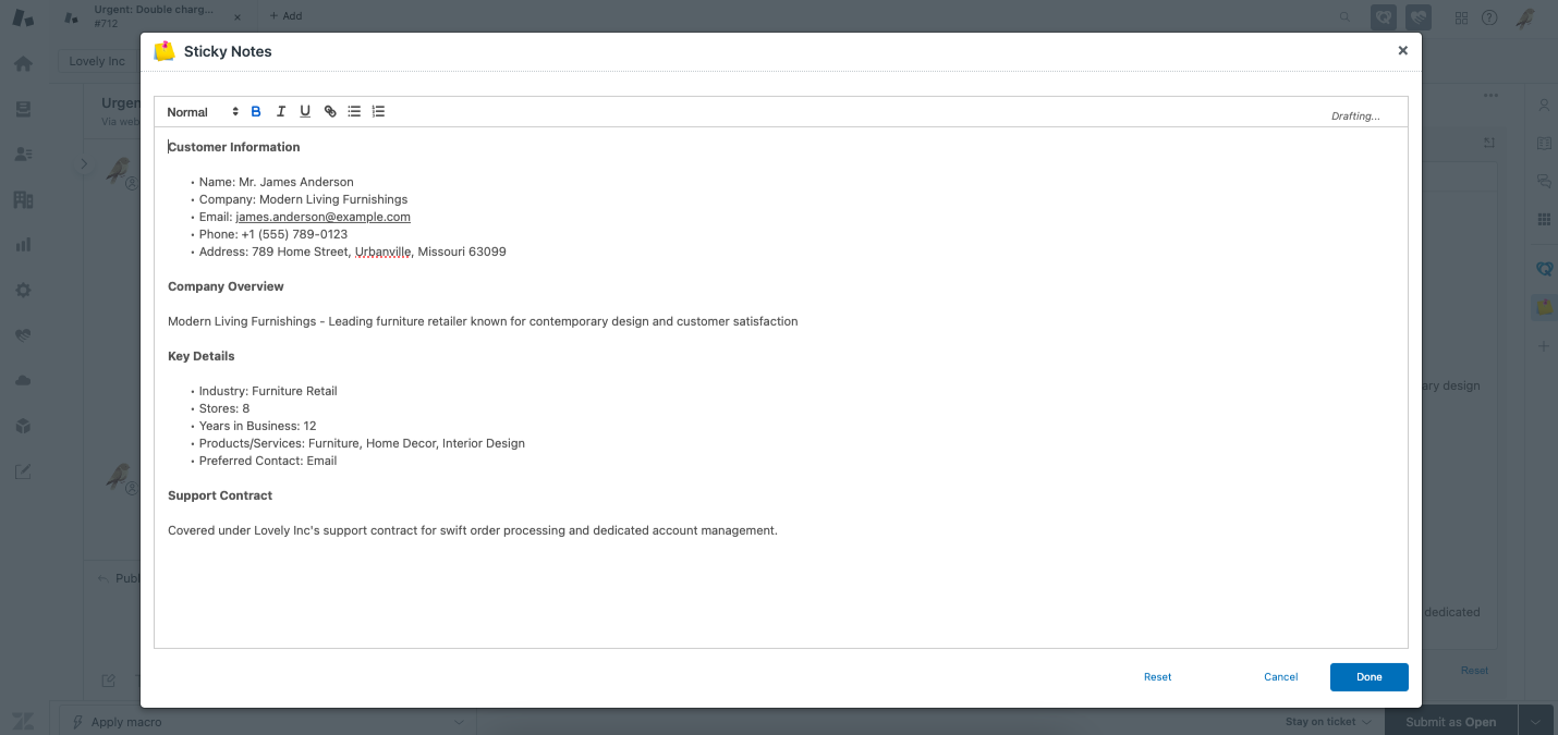
Expandable window
Open a note in a larger dialog to view and edit it more comfortably.
Advanced styling
Style labels and fields so important information stands out, or keep them subtle when needed.
New features
Multi-installs
Sticky Notes can be installed multiple times in the same Zendesk instance, allowing you to configure it differently for specific agent groups or place it in multiple locations on your ticket layouts. Read more here.
Side conversations in pinned comments
Pin side conversations, such as email threads, Slack messages, Microsoft Teams chats, or linked tickets, so they stay visible alongside your pinned comments.
Use the filters to show only the types of comments you want to see. Read more about filtering comments here.
Pin an entire side conversation to keep the full discussion easy to access, or pin individual messages to highlight specific details. Read more about pinning side conversations here.
Ticket editor location
Access Sticky Notes directly within the ticket editing environment. Read more here.
Multi-column option
You can control how notes and other objects are laid out within the same app instance by adjusting the panel width and the Max columns width setting for each object.
The Max columns width setting controls how wide an object is allowed to be. The actual width may vary depending on the object’s content and the available space.
Auto: The object adjusts its width automatically based on the available space.
1–4 columns: The object can span up to the selected number of columns, but may use fewer if there isn’t enough content or space.
Full width: The object stretches across all available columns.
This gives you more flexibility to organize information in a way that fits your layout and priorities.
These settings let you place objects side by side instead of stacking them, making it easier to organize notes within a single app installation.
Installation
Sticky Notes can be installed multiple times within the same Zendesk instance, so different teams can use their own configurations. This section walks through installing the app, setting up multiple instances, and managing their settings.
Initial install
You can install Sticky Notes directly from the Zendesk Marketplace.
1. Start your free trial
- Go to the Sticky Notes listing on the Zendesk Marketplace.
- Click Free Trial and confirm the installation.
2. Configure the app in Zendesk
- After starting the trial, navigate to Zendesk Admin Center > Apps > Zendesk support apps.
- Enter a Title for the installation (e.g., Sticky Notes - Support Team).
- (Optional) Configure role and group restrictions to control access to this Sticky Notes instance.
- Click Update to finalize the setup.
Multi-installs
Sticky Notes supports multiple installations in one Zendesk instance, allowing you to customize different setups for specific teams, workflows, or sections within Zendesk.
-
Custom layouts – Place different Sticky Notes in various ticket sections to separate key information.
-
Role & group-based access – Restrict each Sticky Notes instance to specific roles or teams for better organization.
Each additional instance requires a separate installation through the Zendesk Marketplace.
- Go to the Zendesk Marketplace Sticky Notes listing.
- Click Free Trial again to start a new installation.
- When prompted, enter a unique title (e.g., Sticky Notes - Billing Team).
- Do not use the exact same name as an existing install—this helps distinguish them.
- (Optional) Configure role and group restrictions to control which teams can access this instance.
- Click Install to complete the setup.
Each install functions as a separate instance, meaning teams can configure their own Sticky Notes without affecting others.
Installation settings
After installation, you can update key settings such as the title, role restrictions, and group restrictions.
App title
You can rename an installed instance to reflect its purpose.
- Go to Zendesk Admin Center > Apps > Zendesk Support apps.
- Locate the Sticky Notes instance you want to rename and click the Settings (⚙️) icon.
- Select Change settings for the Sticky Notes install.
- Update the Title field (e.g., Sticky Notes - VIP Support).
- Click Update to save changes.
Role restrictions
Limit Sticky Notes access based on user roles:
- Click the Settings (⚙️) icon and select Change settings for the Sticky Notes install.
- Enable Role restrictions and select the roles allowed to use this instance.
- Click Update to apply changes.
Group restrictions
Restrict access by agent groups:
- Click the Settings (⚙️) icon and select Change settings for the Sticky Notes install.
- Enable Group restrictions and choose the groups that should see this Sticky Notes instance.
- Click Update to save.
These settings help ensure that the right teams have access to relevant Sticky Notes without unnecessary clutter.
Quick Start configuration
After installing Sticky Notes, you’ll need to do some initial setup so it works the way your team needs. The Quick Start guide walks through the setup step by step, covering the most common configuration options in Zendesk.
Most of the setup happens in the app’s settings page, where you can control how Sticky Notes looks and behaves. You can also choose where notes appear in Zendesk, including the new ticket sidebar, ticket sidebar, ticket editor, user sidebar, and organization sidebar. The guide shows how to place different note types in the right locations so important information is visible when it’s needed.
1. To start configuration via Quick Start, open Sticky Notes via the Zendesk sidebar.
2. Click App settings.
3. Use the Quick Start feature to add custom note fields to tickets. Select Existing ticket sidebar when prompted.
4. Click Add.
5. Choose Zendesk field as object type.
6. Select Ticket field and Automatically create new field.
7. Save the above settings to create that object in Existing ticket sidebar location.
8. Make sure to reload the Zendesk webpage (by pressing F5 or Ctrl + R) then open any ticket.
Note fields are now integrated directly into Sticky Notes, making it easy to add and manage custom notes on each ticket.
Note: If you want the same notes field to appear when creating a ticket, repeat the steps for the New ticket sidebar location. In the final step, choose Choose an existing field instead of Automatically create new field, and select the notes field you already created for the Existing ticket sidebar.
Need a visual walkthrough?
If you're having trouble getting Sticky Notes set up after following the steps above, this short video might help. In this example, we walk through how to create the necessary fields, add them to the correct ticket forms, and link them to your Sticky Notes objects.
We’ll show you how to set up both Pinned comments and Logged notes, so you can see exactly how it all comes together in Zendesk.
If you still run into any issues after watching the video, feel free to reach out to us at support@lovestockleaf.com - we're here to help.
Global settings
In this section, admins configure settings that apply to all users.
1. Click More options on Sticky Notes.
2. Select App settings.
3. Click Global settings.
4. You can now make any changes to the default settings shown on the panel.
Here's an overview of each setting available:
Lock empty objects label
Control whether agents can switch between icon and label views for empty object labels. By default, agents can choose how these labels appear, but this setting locks the display to keep it consistent for everyone.
Enable role restrictions?
Turn this on to enforce role-based access, so users only see and access features allowed by their Zendesk role.
Convert ticket IDs to link
When enabled, ticket numbers written with a # (for example, #12345) become clickable links that open the referenced ticket.
User field role override
This experimental option allows agents to edit user fields even if their Zendesk role normally doesn’t allow it. It’s intended for testing or temporary scenarios where more flexible permissions are needed.
Organization field role override
Like the user field override, this experimental setting allows agents to edit organization fields even if their Zendesk role normally restricts it. Use with caution.
Submitting ticket with field(s) in edit mode
Controls what happens if an agent submits a ticket while a field, such as a multi-line field, is still being edited. By default, the ticket submission is blocked and the agent is notified to finish editing first.
Note: Remember to save your changes by clicking the Save after adjusting the settings to ensure they are applied.
Location settings
Use location settings to control where Sticky Notes appears in Zendesk. You can choose which areas of the interface display notes and adjust the layout to match how your team works.
These settings help you decide where notes are visible and how they’re presented, without changing how agents use tickets day to day.
Set display location
Sticky Notes can appear in several places in Zendesk, including the ticket sidebar, ticket editor, user profile, and organization profile. Select the locations you want to use, then configure each one as needed.
1. Click More options on Sticky Notes.
2. Select App settings.
3. Select the display location by choosing from five options: New ticket sidebar, Existing ticket sidebar, Ticket editor, User sidebar, or Organization sidebar.
New ticket sidebar location
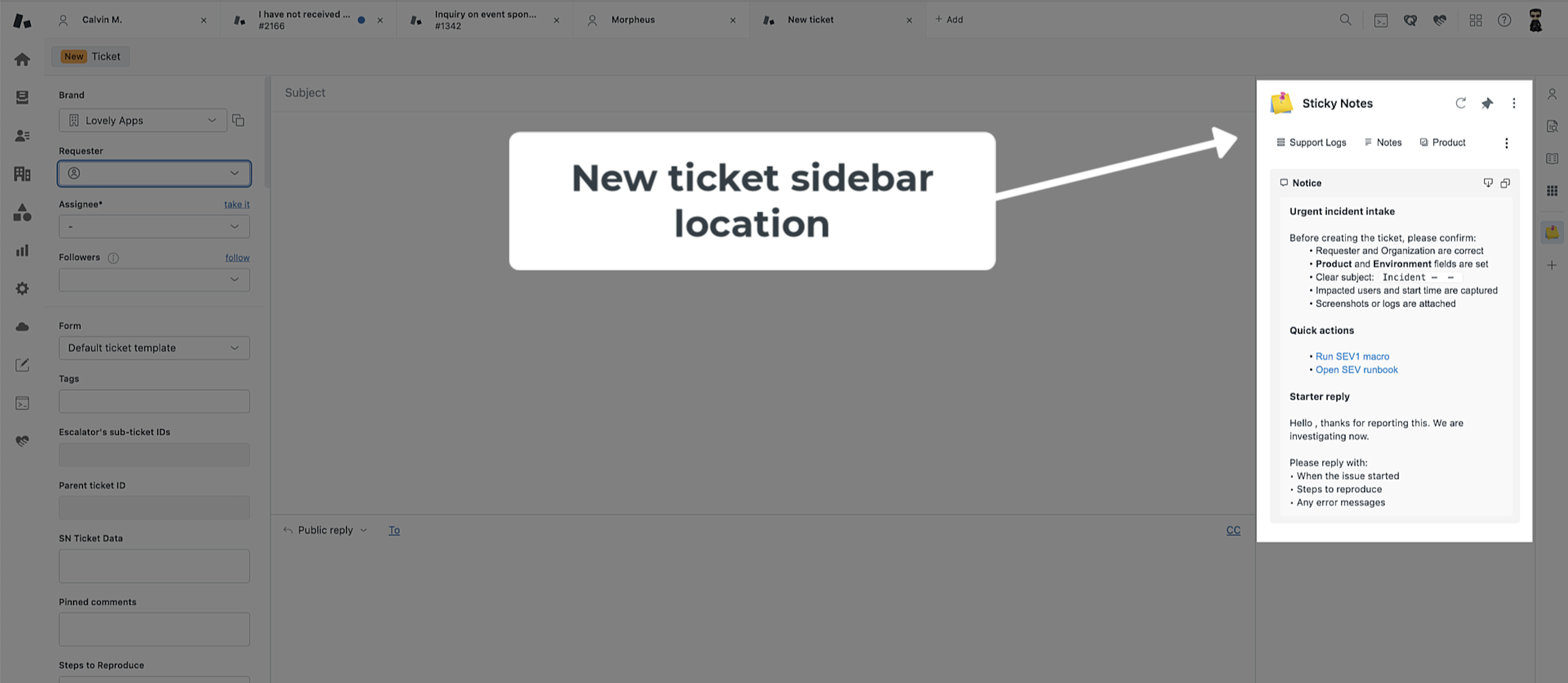
Use this location to show fields and notices when a ticket is first created. It’s useful for capturing required information up front and guiding intake with prompts or alerts.
If the same data should also appear on the ticket later, use existing fields so they can be reused in the Ticket sidebar. Pinned comments aren’t available in this location because the ticket doesn’t have any comments yet.
Ticket sidebar location
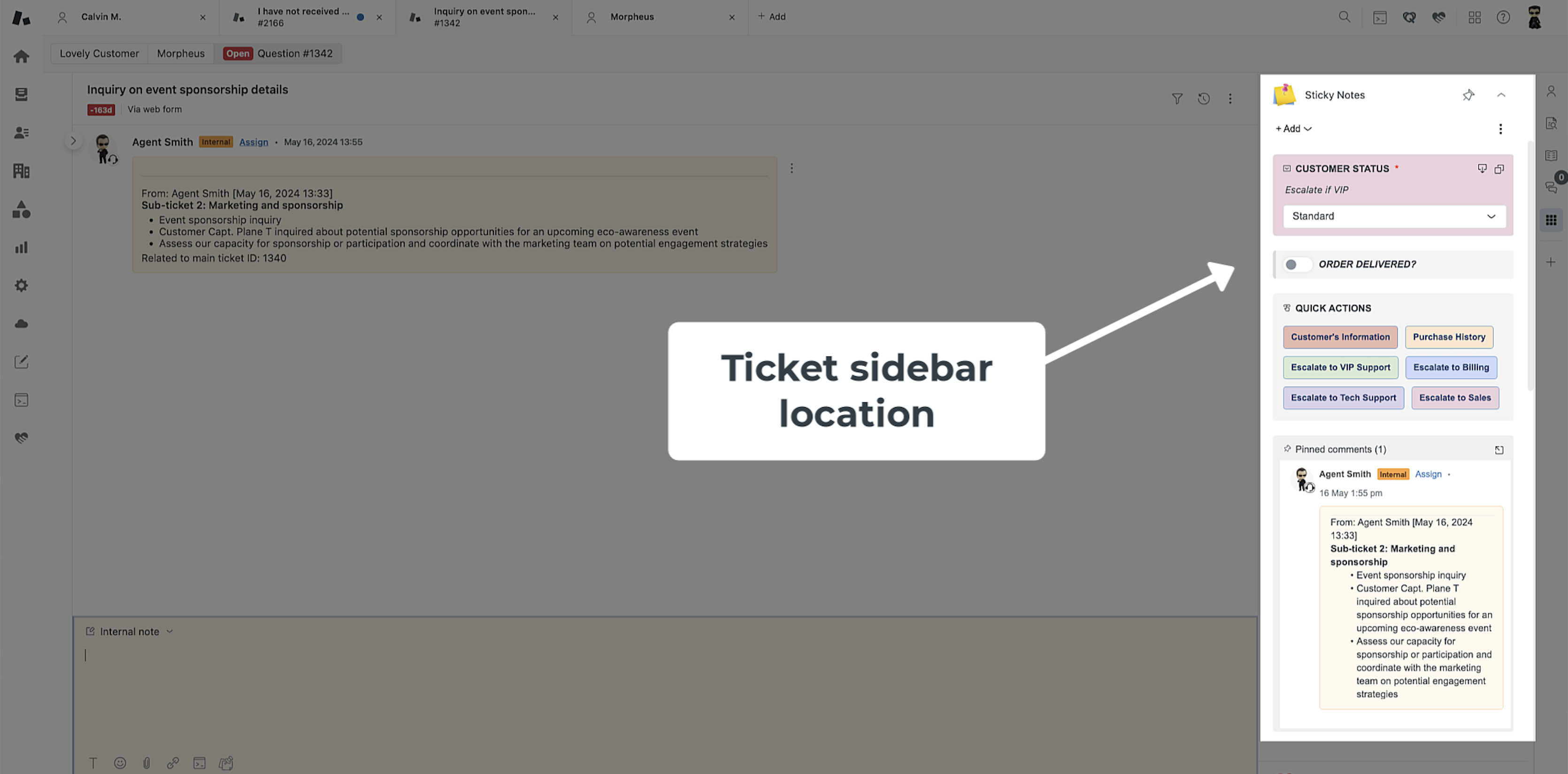
This is the main workspace for existing tickets. Agents can view and update notes, fields, buttons, and pinned comments while working with the full ticket context. It’s the right place for information that needs to stay visible or be updated during triage and resolution.
User sidebar location
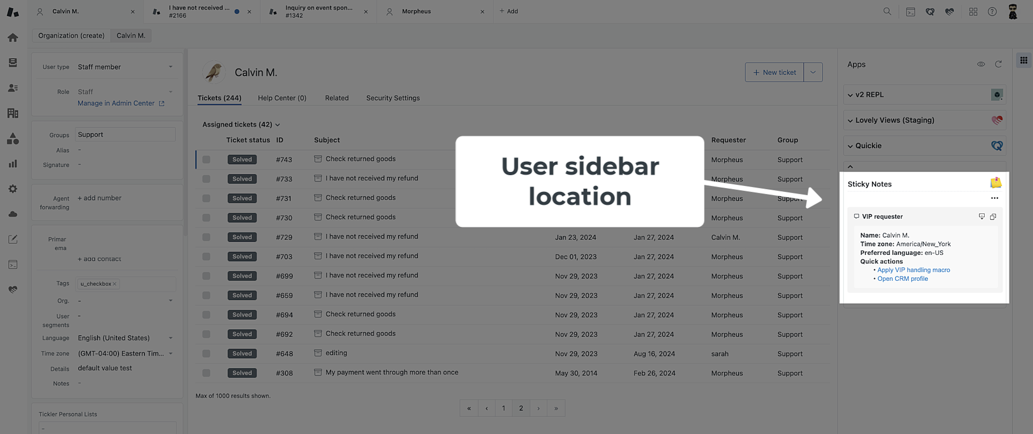
Add requester-specific context that follows the person across all of their tickets. Details saved here - like account tier, IDs, or preferences - show on the user profile and in the requester panel on tickets. It’s a reliable way to keep customer facts consistent for everyone.
Organization sidebar location
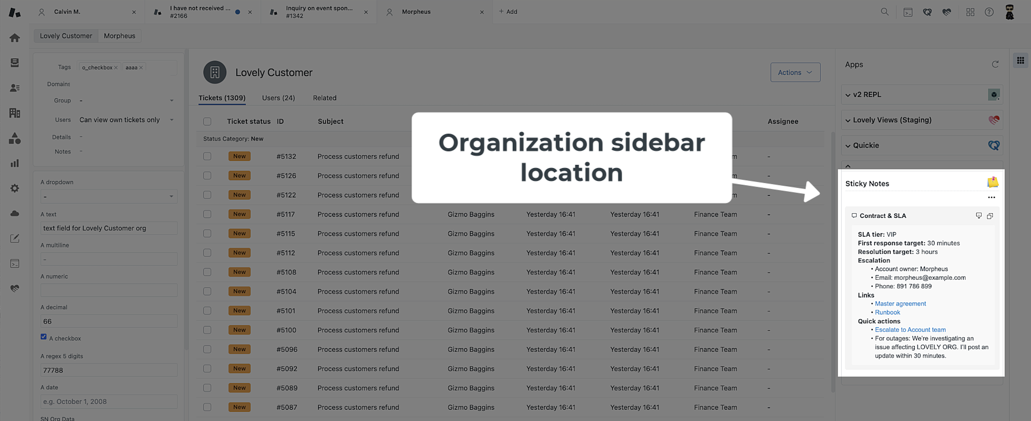
Use this location to store organization-level information that applies across all tickets. Details such as SLAs, contract information, runbooks, or commonly used links appear on the organization profile and in the organization panel on tickets.
Ticket editor location
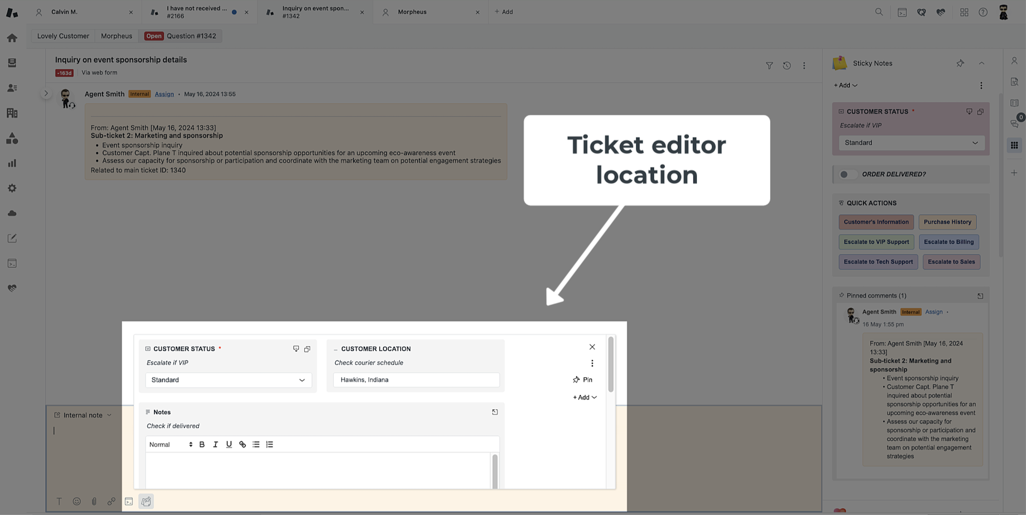
Sticky Notes can be added to the ticket editor, giving agents access to notes and tools while editing or updating a ticket.
When objects are configured for the ticket editor, a Sticky Notes icon appears in the editor. Selecting the icon opens a panel with the configured widgets. If no objects are set for this location, the icon does not appear.
The layout and width of the widgets in the ticket editor panel are controlled by the same logic as the sidebars. The panel's width adjusts depending on the browser window size.
The ticket editor location features a Pin button. When you have pinned comments set up for ticket editor and this button is enabled, any comment submitted in the editor will automatically be pinned, ensuring critical information remains prominent.
Objects in the ticket editor location have an Insert button, which, when clicked, inserts the text into the editor. This can be enabled or disabled for each object.
Note: The ticket editor location is not available for tickets that are closed because the comment editor is unavailable in such tickets.
Modify location preferences
After setting the display location, you can then enable or disable options to manage objects in their existing locations.
Always show in sidebar
By keeping the app in the sidebar even without specific objects or fields, users can easily locate and access the application.
Use empty fields dropdown
This option efficiently conserves vertical space within the app panel, particularly when dealing with multiple empty objects.
Empty objects display mode
Set the default way in which the empty objects will be displayed.
Save ticket field updates
This option is available for New ticket sidebar or Ticket sidebar location. Select whether you would like changes to appear immediately upon update or when ticket is submitted. Note that this behavior can be overridden in the object settings.
Objects in existing ticket sidebar
You can add and customize objects, which includes Logged notes, Pinned comments, Zendesk fields, Notices, and Buttons, each serving a distinct purpose in enhancing agent workflows.
Add more objects or drag and drop the items in the list into the order you want them to appear in the app. You can also clone, disable, or delete individual items in the list.
Logged notes
Logged notes is a powerful tool for creating a field within Sticky Notes that allows the addition of an infinite number of timestamped entries. Each entry includes the author's name, stored as the agent ID, providing comprehensive tracking and logging capabilities for your tickets.
Logged notes - Features
Explore the various features and functionalities of logged notes.
Rich text editor (RTE)
Admins can choose between RTE fields and plain text for data entry.
Record edit permissions
Admins can determine whether existing logged records are editable by agents/groups/roles. Admins always have the ability to edit records.
Personalized visibility
Admins can decide whether ticket ID, requester, date/time, and author details are displayed for agents.
Exclusive admin access
Admins can discreetly hide history and also decide whether logs are added as internal notes.
Logged notes - Add as a new object
Learn how to integrate logged notes as a new object in Sticky Notes.
1. In the Existing ticket sidebar location, click Add and choose Logged notes. You could also instead include the object in New ticket sidebar location.
2. Select your preferences and click Save.
Logged notes - Customize preferences
Tailor your preferences for logged notes to match your workflow, including options for display, formatting, and behavior.
Enable
Toggle this option on to activate the object and allow it to appear on the app. When enabled, the object becomes active and is visible within the application interface. This feature is used to control the presence of the object in the app, providing flexibility in managing which objects are actively displayed.
By utilizing this feature, you have the ability to control the visibility and functionality of the object within the app. This can be particularly useful for managing and organizing content, ensuring that only relevant and active objects are displayed to users.
Ticket / User / Organization
Use the dropdown menu to select which field the object will appear in. This selection determines the category under which the object will be classified within the system.
Ticket field
Select this option if the object is related to tickets or specific support requests. This categorization is suitable for tracking and managing individual incidents or service requests.
User field
Choose this option if the object pertains to user-related information. This may include details about individuals who interact with the system, such as customers, employees, or stakeholders.
Organization field
Opt for this option if the object is associated with organizational data. This category is often used for managing and organizing information related to groups, companies, or entities.
By using the dropdown to specify the field, you can effectively organize and classify objects based on their nature and relevance. This categorization aids in efficient data management and retrieval within the system. Ensure to select the most appropriate category to align objects with the relevant context and purpose.
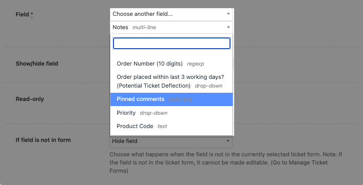
Field
Configure this setting to determine whether to utilize an existing field within your forms or to automatically generate a new field. Selecting Use existing field integrates with your current setup, while choosing to Automatically create new field adds a new element to your form structure, allowing for customization and specificity in data capture.
Show/hide field
Choose to show the field when certain conditions are met, or to always show the field regardless of conditions.
Determine the display behavior of the logged notes field in your system with these configurable options, ensuring that it aligns with the workflow and access needs of your team:
Always show field
The logged notes field is constantly visible, providing consistent access to logged information regardless of the ticket's or agent's status.
Show field when conditions are met
The field becomes visible only under specific conditions, such as when an agent's role, group membership, or ticket attributes like brand, form, or tags match predefined criteria.
Hide field when conditions are met
Opposite to the above, this option hides the logged notes field when certain conditions are fulfilled, potentially streamlining the interface by removing unnecessary information for certain scenarios.
These settings offer you the flexibility to manage when the logged notes field should be a part of the agent's interface, optimizing the display of information for efficiency and clarity in your ticket management system.
Customize when the logged notes fields in your application are shown or hidden by setting specific conditions tied to the characteristics of the ticket and the agent handling it.
Agent is in ANY of these role(s)
Display the logged notes field if the agent viewing the ticket has one or more of the specified roles.
Agent is in ALL of these group(s)
Make the logged notes field visible only when the agent is part of all the listed groups.
Agent is in ANY of these group(s)
The logged notes field is shown if the agent belongs to any of the groups mentioned.
Is ANY of these brand(s)
The field will be displayed if the ticket is associated with any of the selected brands.
Note: This condition option only appears when using multiple brands within the system. The option will not appear if only a single brand is configured.
Is ANY of these ticket form(s)
Show the logged notes field when the ticket includes any of the specified ticket forms.
Note: This condition option only appears when utilizing multiple forms. The option will not appear if only a single form is in use.
Group assignment
While most field visibility conditions are consistent across all locations, the condition related to group assignment varies based on the sidebar. Below is the breakdown of how this condition should be set depending on the sidebar you are configuring:
Is assigned to ANY of these group(s) - For New ticket sidebar or Ticket sidebar - Show or hide field if the ticket is assigned to any of the specified groups, providing group-specific information necessary for ticket resolution.
Is in any of these group(s) - for User sidebar - Show or hide field if the user is in any of the specified groups, providing group-specific information necessary for ticket resolution. This evaluates the group membership based on the group ID(s) associated with the user profile being viewed.
Is in any of these group(s) - for Organization sidebar - Show or hide field if the user's organization is associated with any of the specified groups, providing group-specific information necessary for ticket resolution. This condition uses the group ID(s) associated with the organization to which the user belongs.
Contains ALL of these tag(s)
Display the field when every one of the entered tags is present in the ticket.
Contains ANY of these tag(s)
The logged notes field will be shown if any of the provided tags are attached to the ticket.
These conditions allow for a dynamic user interface, where the logged notes fields are presented in a context-sensitive manner, enhancing the relevance of displayed information for agents during their ticket resolution process.
Read-only
Toggle this option on if you wish to display the field in read-only mode within the app. When this option is activated, the field becomes view-only, preventing users from making edits or changes. This feature is particularly useful when you want to showcase information that should not be altered or when you want to ensure data consistency.
Enabling Read-only is suitable for scenarios where you want to communicate specific details without allowing user modifications. For example, if you have a field for displaying historical data or reference information, turning on 'Read-only' ensures that the content remains static and serves as a reference point for users without the risk of unintentional edits.
Please note that when Read-only is toggled on, the field becomes locked for editing, and users will only be able to view the information without the ability to make changes directly through the app interface.
Label
Specify the title or name to be displayed on the app for the respective object. For example, if the field is for customer support agents to enter their troubleshooting logs, the label might be "Support logs". You can also use placeholders and Liquid markup here.
Value hint
The value hint is a temporary, non-submitted text that is displayed inside the input field to give users an idea of the type of information expected. It acts as a visual cue or prompt, guiding users on what to input. Once users start typing, the value hint disappears, and their actual input is shown.
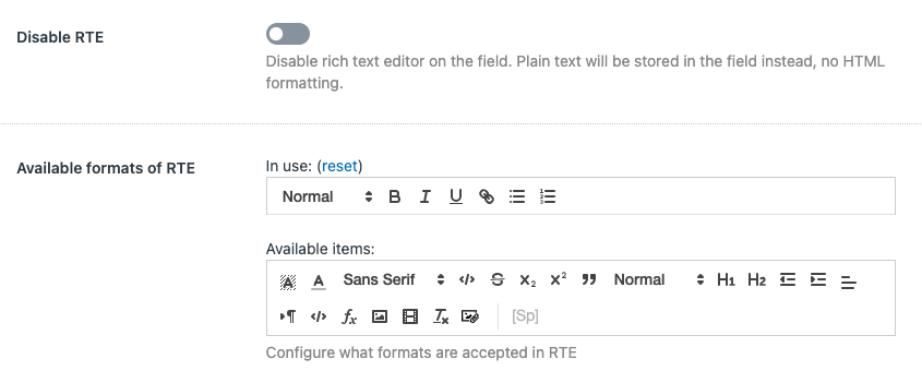
Disable RTE
Turn on this setting to switch the field input from a rich text format to plain text, removing options for HTML styling and formatting. This ensures the information is stored and displayed without any text styling elements.
Available formats of RTE
Customize the rich text editor's toolbar by selecting the formatting tools that your agents are allowed to use. This configuration determines the options available when editing text, such as bold, italic, underline, and list formatting, to align with your organization's documentation standards.
Who can edit/delete logs
Set permissions for who has the authority to modify or remove logs.
Admins
Only administrators can edit or delete logs, ensuring high-level control.
Admins and particular groups/roles/users
Extend permissions to include specific groups, roles, or users along with admins.
All agents
Grant all agents the capability to manage their logs, fostering a collaborative environment.
This setting is designed to help maintain the integrity of logs while accommodating different workflow requirements.
Author can edit/delete their own logs
Enable this option to allow authors to modify or remove their own logs. This setting operates independently and does not impact the permissions granted to admins or other agents as specified in the previous setting.
Max columns width
This feature allows you to customize the layout of objects on the screen. Fields automatically disable if already in use, preventing redundancy. Additionally, the multi-column layout ensures efficient visibility, making it easier to view and manage multiple fields at a glance.
Auto
The app intelligently adjusts the number of columns. Most field types will display in a single column for a compact view. However, fields that typically contain more content—such as multi-line fields, notices, logged notes, and pinned comments—will automatically span two columns. Additionally, any text field containing more than 30 characters will also expand to take up two columns, allowing for easier reading of longer entries.
1, 2, 3, or 4
Manually set the app to display your notes in 1, 2, 3, or 4 columns. This is useful when you want a consistent, fixed-column layout regardless of window size.
Full width (All columns)
This option allows your notes to expand across the entire width of the app window. The notes will adjust in size to fill the space, which can be useful if you prefer larger notes or a more fluid layout when you resize the app window.
If you're using a larger display or have many notes, 'Full Width (All Columns)' can help maximize your space. For smaller displays or for a more focused view of your notes, selecting a fixed number of columns may be more beneficial. Remember, you can change this setting at any time to adapt to your current workflow needs or screen setup.
Note: When the sidebar is being resized, the columns will increase in width until they get to the point where another column can be added.
Descriptions
These settings allow you to incorporate descriptive information about the object in various ways.
Description above
When selected, the object's description will be displayed above the designated field within the app interface. Enter relevant details to provide immediate context or instructions.
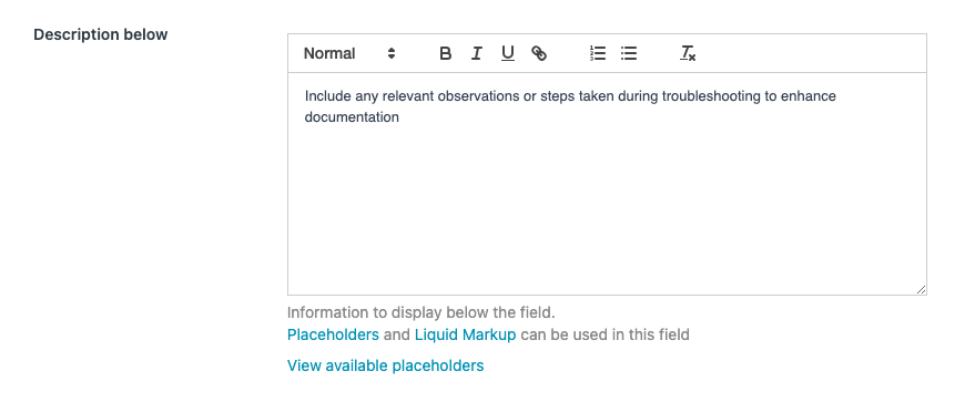
Description below
Choosing this option places the object's description below the designated field in the app interface. Provide additional details or explanations related to the designated field.
Description tooltip
If this option is activated, a tooltip containing the object's description will appear when users hover over the designated field. Offer concise information without cluttering the main interface.
Additionally, you can insert placeholders to dynamically display specific details related to the designated field (e.g., {{username}}, {{email}}) in the description. You can also leverage Liquid markup for more advanced dynamic content, allowing you to customize and tailor descriptions based on attributes of the designated field.
Show when empty
You have the option to customize how an empty field is displayed to users.
Default - Do not show when empty
When a field is empty, it is shown as an option in the empty field area at the top of the app. This provides users with a clear indication that the field is available for input.
Toggled on - Show when empty
Alternatively, you can choose to display an empty field as being open and ready to be edited, mimicking the appearance when the field is not empty. This option enhances consistency in the interface, creating a visual cue that encourages users to input data.
Choose the display option that aligns with your design preferences and user experience goals.
Do not hide original field
Enable this option to keep the field visible in the left sidebar, overriding the default setting that hides them for a cleaner view.
Label and field style
This feature allows you to personalize the visual appearance of both the label and the field associated with the object. Customize various style attributes to achieve the desired aesthetic and enhance readability.
Text color
Adjust the color of both the label and field text to match your design preferences. Choose a color that provides optimal contrast and readability against the background.
Background color
Set the background color behind both the label and the field to create visual distinction. This enhances the visibility of both elements within the app interface.
Font size
Modify the size of both the label and field text to control their prominence. Select a font size that aligns with your design and readability objectives.
Bold
Toggle the bold option for both the label and field text to make them more prominent and visually distinct. Useful for emphasizing crucial information.
Italic
Activate the italic option for both the label and field text to add a stylistic touch. Italics can convey emphasis or contribute to a unique visual style.
By leveraging these combined styling options for both labels and fields, you can create a cohesive and visually pleasing interface that aligns with your design language and user experience goals. Experiment with different combinations to achieve the desired aesthetic.
Display ticket ID
Customize how the ticket ID is displayed in logs with the following options.
Show
The ticket ID will be continuously visible.
Expand to reveal
The ticket ID will be hidden but can be viewed by expanding the log entry.
Don't show
The ticket ID will not be displayed in the logs.
Note: Regardless of the chosen setting, administrators will always have the ability to see the ticket IDs.
Display requester
Adjust the display settings for the requester information in logs.
Show
Requester details will be constantly visible in the logs.
Expand to reveal
Requester details will be hidden by default but can be viewed by expanding the log entry.
Don't show
Requester details will not be displayed in the logs.
Note: Administrators will retain the ability to view requester details regardless of the setting selected.
Display date/time
Control the visibility of date and time information in logs.
Show
The date and time will be always visible for each log entry.
Expand to reveal
The date and time are hidden but can be viewed by expanding the log entry.
Don't show
The date and time will not be displayed in the logs.
Note: Regardless of the option chosen, administrators will continue to have the ability to see the date and time details for each log.
Display author
Set preferences for author visibility in log entries.
Show
The author's name will be permanently displayed.
Expand to reveal
The author's name will be hidden but can be made visible by expanding the log entry.
Don't show
The author's name will not be displayed within the log entries.
Note: No matter which setting is chosen, administrators will retain the ability to view the author of each log.
Hide history
Enable this setting to conceal the log history from the view. This can help streamline the user interface by displaying only the most recent log entries.
Add log as internal note
Activate this toggle to automatically duplicate any new log entries as internal notes within the ticket. This ensures that all log changes are recorded and accessible in the ticket's internal communication history.
Modify preferences
To modify previously configured preferences for Logged notes, simply locate the object in the Objects in existing ticket sidebar list, or whichever location you previously chose for the object. A single click on the object will reveal the preferences panel.
Proceed to make any required adjustments, and don't forget to save your changes by clicking Save when you're finished.
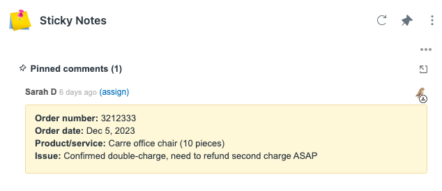
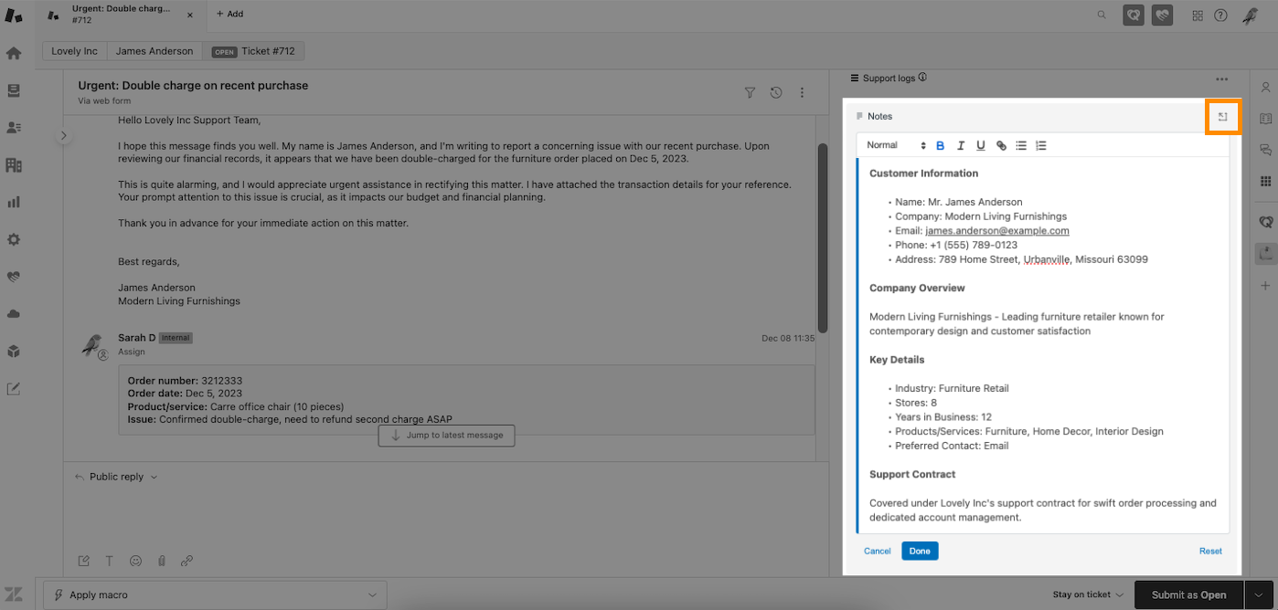
Pinned comments
Pinned comments let you spotlight and prioritize crucial information within a ticket. By pinning specific comments or side conversations at the top, you make sure essential details are easy to find, helping you focus on what matters most.
Pinned comments - Features
Keep important details front and center
Pinned comments let you highlight key information at the top of a ticket, ensuring critical updates stay visible. Whether it’s an urgent request, a key customer detail, an approval, or even a side conversation, pinned comments make sure important information is always at hand.
Stay on the same page
No more digging through long ticket threads—pin important updates so everyone working on the ticket sees them immediately. You can now pin entire side conversations or specific messages from email threads, Slack, Microsoft Teams, or linked tickets, making it easy to track key discussions without losing context.
Keep your tickets organized
Pinned comments help maintain a clean and structured ticket view. Instead of losing crucial details in a sea of replies, agents can quickly find what matters most. Whether it’s troubleshooting notes, escalation updates, or important approvals, pinning comments and side conversations ensures the right information is always at your fingertips.
Pinned comments - Add as a new object
Learn how to integrate pinned comments as a new object in Sticky Notes.
1. In Zendesk's Admin Center, under Objects and rules > Tickets > Fields, create a new custom ticket field of the type Multi-line to serve as the storage space for the app's pinned comments.
2. Assign a display name for the new field you're creating. In this example, we've chosen "Pinned Comments" as the designated display name for the multi-line field. Set permissions to "Agents can edit," then click Save.
3. Reload the Zendesk browser page, and the display name of your newly added field should now appear on your Zendesk fields list.
Note: If the display name doesn’t appear in the fields list immediately after creating the new field, this delay may be due to caching. Wait a few minutes, refresh the page, and then check again. More information on adding Zendesk fields can be found here: Creating custom fields - Zendesk
4. For seamless integration of pinned comments in Zendesk's ticket forms, add the new multi-line field to relevant forms via Zendesk's Admin Center, under Objects and Rules > Tickets > Forms. In our example, we've integrated the field into the Default ticket form (active).
Note: This step is applicable only if you incorporate ticket forms into your workflow.
5. Search the display name you created earlier for the multi-line field. In our example, it is Pinned comments.
6. Once the display name appears, click + next to it. In our example, the + next to Pinned comments is clicked.
7. It should now appear on your default form list.
8. Don't forget to click Save.
9. Integrate the pinned comments object into the Existing ticket sidebar or the Ticket editor as these are the only locations containing comments. In this example, in App settings, via Quick Start, choose Existing ticket sidebar.
10. Click Add.
11. Select Pinned comments. Notably, unlike other objects, the pinned comments object is a one-time addition to this location.
12. Within the Pinned comments field setting, designate the custom field created for pinned comments. In our example, Pinned comments is selected. This was the display name we used for the new multi-field we created earlier.
Note: In case the display name doesn't promptly appear in the dropdown list after creating the new field, this delay may be due to caching. Wait a few minutes, refresh the page, and then recheck.
13. Pinned comments are presented in chronological order, with the newest comments shown first by default. If you prefer to arrange the comments from oldest to newest, simply enable the Show oldest comment first toggle.
14. Click Save, then reload the browser page to activate the use of pinned comments within an existing ticket.
15. The pinned comments feature should now appear on the app. When viewing a ticket, click Pinned comments to start pinning.
16. Public and private comments for the current ticket will appear in a dialog. To pin a specific comment to the sidebar, simply click Pin next to that comment.
17. Select Done to confirm your action or Cancel to undo the operation.
18. The pinned comment is now visible on the sidebar.
19. If you selected Ticket editor as the location for pinned comments, you will then be able to click the Pin button on the top-right corner which automatically pins the comment upon ticket submission.
Pinned comments - Customize preferences
Customize your preferences for pinned comments to align with your workflow, including options for display, formatting, and behavior.
Enable
Toggle this option on to activate the object and allow it to appear on the app. When enabled, the object becomes active and is visible within the application interface. This feature is used to control the presence of the object in the app, providing flexibility in managing which objects are actively displayed.
By utilizing this feature, you have the ability to control the visibility and functionality of the object within the app. This can be particularly useful for managing and organizing content, ensuring that only relevant and active objects are displayed to users.
Pinned comments field
Choose a custom ticket field from the dropdown menu to store data related to pinned comments. This field will be used for easy access and reference within the ticketing system.
Show oldest comment first
Enable this to reverse the comment order, displaying entries from oldest to newest, providing a chronological flow of conversation.
Label
Enter a custom label for the pinned comments section as displayed in the app interface. The default label is Pinned comments.
Field tag(s)
Input tags in this field to automatically associate them with the ticket whenever this particular field is utilized. This feature helps in categorizing and filtering tickets based on the specific tags assigned.
Max columns width
This feature allows you to customize the layout of objects on the screen. This setting is particularly useful for managing the way notes are displayed when the Sticky Notes app window is resized or viewed on different screen sizes.
Auto
The app intelligently adjusts the number of columns. Most field types will display in a single column for a compact view. However, fields that typically contain more content—such as multi-line fields, notices, logged notes, and pinned comments—will automatically span two columns. Additionally, any text field containing more than 30 characters will also expand to take up two columns, allowing for easier reading of longer entries.
1, 2, 3, or 4
Manually set the app to display your notes in 1, 2, 3, or 4 columns. This is useful when you want a consistent, fixed-column layout regardless of window size.
Full width (All columns)
This option allows your notes to expand across the entire width of the app window. The notes will adjust in size to fill the space, which can be useful if you prefer larger notes or a more fluid layout when you resize the app window.
If you're using a larger display or have many notes, 'Full Width (All Columns)' can help maximize your space. For smaller displays or for a more focused view of your notes, selecting a fixed number of columns may be more beneficial. Remember, you can change this setting at any time to adapt to your current workflow needs or screen setup.
Note: When the sidebar is being resized, the columns will increase in width until they get to the point where another column can be added.
Label style
Customize the appearance of field labels within the application using these settings.
Text color
Change the color of the label text to enhance visibility or match your branding.
Background color
Select a color for the label's background for better contrast or aesthetic preference.
Font size
Choose from a range of sizes to make the label more readable or to emphasize importance.
Bold
Toggle on to make the label text bold, highlighting it for users.
Italic
Toggle on to italicize the label text, adding emphasis or distinguishing it from other text.
These style options allow you to personalize the look of your application's labels to fit your organizational needs and user interface design.
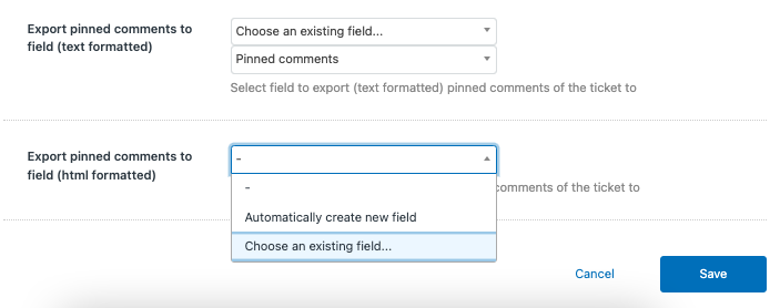
Export pinned comments to field (text formatted)
Choose a destination for storing text-formatted pinned comments from tickets by selecting an existing field or creating a new one. This feature facilitates the organization and retrieval of critical comment data for reporting or analysis purposes.
Export pinned comments to field (html formatted)
Choose an appropriate field to export pinned comments with HTML formatting, ensuring that the stylistic and structural elements of the comments are preserved upon transfer. This option is ideal for maintaining the original formatting for comprehensive record-keeping or detailed reviews.
Pinned comments - Modify preferences
To modify previously configured preferences for pinned comments, simply locate the desired object in the Objects in existing ticket sidebar or Objects in ticket editor list, depending on where you added it. A single click on the object will reveal the preferences panel.
Proceed to make any required adjustments, and don't forget to save your changes by clicking Save when you're finished.
Pinned comments - Side conversations
Side conversations—including email threads, Slack messages, Microsoft Teams chats, and linked tickets—can now be pinned just like regular ticket comments. This makes it easier to keep track of important discussions without searching through long conversation histories.
Side conversations in Zendesk allow agents to communicate with other departments, vendors, or external stakeholders directly from a ticket. These can take the form of:
- Emails – Internal or external email threads related to the ticket.
- Slack messages – Conversations with teams for troubleshooting or approvals.
- Microsoft Teams chats – Messages exchanged with colleagues for collaboration.
- Linked tickets – References to related tickets or follow-up requests.
With Sticky Notes’ pinned comments feature, you can now pin entire side conversations or individual messages within a thread for quick reference and better visibility.
Pinning an entire side conversation
To pin an entire side conversation so the full discussion remains visible:
- Open the ticket containing the side conversation.
- Click Add - Pinned comments.
- Select Side conversations from the dropdown filter menu, or find the side conversation directly from the full list.
- Click the Pin button 📌 to add it to the Pinned comments list.
- Click Save.
Best for: Keeping ongoing discussions accessible without needing to open multiple tabs.
Pinning a specific message or reply within a side conversation
If only part of a conversation is relevant, you can pin a specific message instead of the whole thread:
- Open the ticket containing the side conversation.
- Click Add - Pinned comments.
- Select Side conversations from the dropdown menu, or find the side conversation directly from the full list.
- Click the side conversation box to open the thread.
- Click the Pin button 📌 next to a specific message or reply to add it to the Pinned comments list.
- Click the X button on the top-left of the side conversation thread to return to the main comments list.
- Click Save.
Best for: Highlighting specific details like approval confirmations, next steps, or troubleshooting instructions.
Pinned comments - Filtering comments
Pinned comments help you quickly access important messages within a ticket. You can pin or unpin messages as needed, ensuring that key updates, logs, or internal discussions remain easily visible.
Use the filter dropdown to display only the type of comments you're looking for, making it easier to focus on relevant messages. Available filters include:
- All comments – Displays every comment in the ticket, including side conversations.
- Ticket comments – Shows all ticket comments, including both public replies between agents and customers, as well as private/internal comments.
- Requester’s comments – Filters to display only messages from the ticket requester.
- Internal comments – Displays only private notes added by agents.
- Public replies – Shows only customer-facing responses.
-
Side conversations – Filters internal discussions that were created as side conversations within the ticket. Click the side conversation to see panel for the entire thread.
By selecting the appropriate filter, you can keep your view organized and find the information you need more efficiently.
Zendesk fields
To furnish a notes field for your agents, leverage Zendesk field to store the data they input. Whether utilizing existing fields or creating new custom ticket fields, the versatility extends to various field types supported by Zendesk.
- Checkbox
- Drop-down
- Text
- Multi-line
- Multi-select
- Numeric
- Decimal
- Date
- Credit card
- Regex
Crucially, if employing Zendesk's multiple ticket forms feature, ensure the inclusion of the field in all forms. Failure to do so may result in Sticky Notes not displaying the field on forms lacking the requisite field configuration.
Notes
Notes (contained inside Zendesk field) serve as a dynamic and visible means of adding essential information to tickets, users, or organizations.
Continuous updates
Ensure information remains relevant throughout the life of the ticket.
Versatility
Accommodate various field types for a wide range of information.
Collaboration
Provide a collaborative platform for team members to contribute and stay informed.
Rich text editing
Incorporate formatted text for clarity and emphasis.
Customizable fields
Tailor notes to specific needs with customizable fields.
Comprehensive solution
Capture, organize, and share crucial details seamlessly.
Efficient communication
Foster efficient communication and streamlined workflows.
Zendesk field - Add as a new object
Learn how to integrate Zendesk fields as a new object in Sticky Notes.
1. In this example, in the Existing ticket sidebar location, click Add and choose Zendesk field. You could also instead include the object in a different location.
2. Select your preferences and click Save.
Zendesk field - Customize preferences
Tailor your preferences for Zendesk field to match your workflow, including options for display, formatting, and behavior.
Enable
Toggle this option on to activate the object and allow it to appear on the app. When enabled, the object becomes active and is visible within the application interface. This feature is used to control the presence of the object in the app, providing flexibility in managing which objects are actively displayed.
By utilizing this feature, you have the ability to control the visibility and functionality of the object within the app. This can be particularly useful for managing and organizing content, ensuring that only relevant and active objects are displayed to users.
Ticket / User / Organization
Use the dropdown menu to select which field the object will appear in. This selection determines the category under which the object will be classified within the system.
Ticket field
Select this option if the object is related to tickets or specific support requests. This categorization is suitable for tracking and managing individual incidents or service requests.
User field
Choose this option if the object pertains to user-related information. This may include details about individuals who interact with the system, such as customers, employees, or stakeholders.
Organization field
Opt for this option if the object is associated with organizational data. This category is often used for managing and organizing information related to groups, companies, or entities.
By using the dropdown to specify the field, you can effectively organize and classify objects based on their nature and relevance. This categorization aids in efficient data management and retrieval within the system. Ensure to select the most appropriate category to align objects with the relevant context and purpose.
Field
Configure this setting to determine whether to utilize an existing field within your forms or to automatically generate a new field. Selecting Use existing field integrates with your current setup, while choosing to Automatically create new field adds a new element to your form structure, allowing for customization and specificity in data capture.
Save ticket field updates
Select the preferred timing for saving updates made to ticket fields. Options include adhering to the current global default or specifying a unique save action for this particular setting. The global default can be adjusted in the Global Settings, whereas here you can choose to save either immediately upon each update or only when the ticket itself is submitted, offering tailored control to fit your workflow.
Show/hide field
This feature allows you to control the visibility of a field based on specified conditions. Use the dropdown menu to select how conditions will impact the appearance of the field within the app.
Always show field
The field will be visible at all times, irrespective of specified conditions. Ideal for ensuring constant visibility of critical information or elements within the app interface.
Show field when conditions are met
When conditions are met, the field will be displayed in the app. Useful when you want certain information to appear only under specific circumstances.
Hide field when conditions are met
When conditions are met, the field will be hidden from view in the app. Helpful for streamlining the user interface or presenting information dynamically based on user interactions.
Adjust the visibility of a Zendesk field dynamically by establishing conditions that reflect the agent's roles, group memberships, and the nature of the ticket. This customization ensures that agents see the most relevant and necessary information to efficiently resolve tickets.
Agent is in ANY of these role(s)
Set field visibility to change when the agent viewing the ticket matches any of the specified roles, enabling role-specific customization.
Agent is in ALL of these group(s)
Configure field to be visible only when the agent is a member of all the listed groups, ensuring that fields are only shown to agents with specific cross-functional access.
Agent is in ANY of these group(s)
Adjust field visibility to allow any agent who is a member of any of the listed groups to view certain fields, broadening the accessibility of information when appropriate.
Is ANY of these brand(s)
Make the field visible only if the ticket is associated with any of the selected brands.
Note: This condition option only appears when using multiple brands within the system. The option will not appear if only a single brand is configured.
Is ANY of these ticket form(s)
Display field based on the ticket form used. This condition allows for form-specific field visibility, tailoring the ticket layout to the form's context.
Note: This condition option only appears when utilizing multiple forms. The option will not appear if only a single form is in use.
Group assignment
While most field visibility conditions are consistent across all locations, the condition related to group assignment varies based on the sidebar. Below is the breakdown of how this condition should be set depending on the sidebar you are configuring
Is assigned to ANY of these group(s) - For New ticket sidebar or Ticket sidebar - Show or hide field if the ticket is assigned to any of the specified groups, providing group-specific information necessary for ticket resolution.
Is in any of these group(s) - For User sidebar - Show or hide field if the user is in any of the specified groups, providing group-specific information necessary for ticket resolution. This checks the assignee group ID against the specified group IDs to determine whether to show or hide the field.
Is in any of these group(s) - For Organization sidebar - Show or hide field if the user's organization is associated with any of the specified groups, providing group-specific information necessary for ticket resolution. This condition uses the group ID(s) associated with the organization to which the user belongs.
Contains ALL of these tag(s)
Set field to be visible only when all the specified tags are present on a ticket, which is useful for showing additional fields relevant to specific ticket categorizations.
Contains ANY of these tag(s)
Adjust field visibility when any of the specified tags are attached to a ticket, allowing for a more flexible display of fields relevant to various ticket scenarios.
These conditions enable administrators to fine-tune the ticketing interface to reflect the operational structure and workflow of their support team, enhancing the relevance and efficiency of the data agents see.
Read-only
Toggle this option on if you wish to display the field in read-only mode within the app. When this option is activated, the field becomes view-only, preventing users from making edits or changes. This feature is particularly useful when you want to showcase information that should not be altered or when you want to ensure data consistency.
Enabling Read-only is suitable for scenarios where you want to communicate specific details without allowing user modifications. For example, if you have a field for displaying historical data or reference information, turning on Read-only ensures that the content remains static and serves as a reference point for users without the risk of unintentional edits.
Please note that when Read-only is toggled on, the field becomes locked for editing, and users will only be able to view the information without the ability to make changes directly through the app interface.
If field is not in form
Determine the behavior of fields that are not included in the currently selected ticket form.
Hide field
The field will not be displayed if it is not part of the ticket form.
Show as read-only
The field will be visible but cannot be edited if it is not part of the ticket form.
This setting is crucial for maintaining a streamlined ticket interface while ensuring that necessary information is still accessible when needed.
Label
Specify the title or name to be displayed on the app for the respective object. You can also use placeholders and Liquid markup here.
Value hint
The value hint is a temporary, non-submitted text that is displayed inside the input field to give users an idea of the type of information expected. It acts as a visual cue or prompt, guiding users on what to input. Once users start typing, the value hint disappears, and their actual input is shown.
Note: The feature to display value hints is not applicable to fields such as checkboxes, dropdown menus, and multiselect options. These field types inherently provide clear options to users.
Default value
The default value provides initial content within an input field when a ticket is newly created and the field is initially empty. This content is intended to guide users with suggested information or to kickstart the ticket with predefined data. When an agent opens a ticket for the first time and the app runs, the default value is displayed in the field—even if the ticket has not yet been saved or submitted.
The input for the default value will adjust to match the type of field in use. For instance, if the selected field is a dropdown, the default value will be shown as a dropdown.
If the field type is a rich text editor, the default value will be displayed accordingly.
For the default value to transition from merely being displayed to being saved, the following actions are required:
For user or organization fields - The app must execute once, after which the default value is automatically saved.
For ticket fields - After the app inputs the default value, the agent must save the ticket to capture and record this value within the Zendesk system.
Note: Agents should be aware that although they may see a default value in the ticket's fields upon first opening, this does not necessarily mean the value is part of the ticket's recorded data. It remains a display feature until the ticket is saved. Any reports, triggers, or API calls made before saving will not reflect the default value because, within the system, the field is still considered empty.
Force show app tray when not empty
Enable this so that when there is content in the app tray, it will remain visible on the screen even when the app tray itself is closed. This feature is designed to enhance accessibility, allowing users to quickly access relevant information without having to open the app tray. Please note that this behavior applies specifically when there is content present in the app tray.
Max columns width
This feature allows you to customize the layout of objects on the screen. This setting is particularly useful for managing the way notes are displayed when the Sticky Notes app window is resized or viewed on different screen sizes.
Auto
The app intelligently adjusts the number of columns. Most field types will display in a single column for a compact view. However, fields that typically contain more content—such as multi-line fields, notices, logged notes, and pinned comments—will automatically span two columns. Additionally, any text field containing more than 30 characters will also expand to take up two columns, allowing for easier reading of longer entries.
1, 2, 3, or 4
Manually set the app to display your notes in 1, 2, 3, or 4 columns. This is useful when you want a consistent, fixed-column layout regardless of window size.
Full width (All columns)
This option allows your notes to expand across the entire width of the app window. The notes will adjust in size to fill the space, which can be useful if you prefer larger notes or a more fluid layout when you resize the app window.
If you're using a larger display or have many notes, 'Full Width (All Columns)' can help maximize your space. For smaller displays or for a more focused view of your notes, selecting a fixed number of columns may be more beneficial. Remember, you can change this setting at any time to adapt to your current workflow needs or screen setup.
Note: When the sidebar is being resized, the columns will increase in width until they get to the point where another column can be added.
Field tag
Specify tags to be automatically associated with a ticket whenever the field is populated. Inputting tags here allows for enhanced ticket sorting and categorization, enabling better workflow automation and organization within the ticketing system.
Disable RTE
Turn on this setting to switch the field input from a rich text format to plain text, removing options for HTML styling and formatting. This ensures the information is stored and displayed without any text styling elements.
Available formats of RTE
Customize the rich text editor's toolbar by selecting the formatting tools that your agents are allowed to use. This configuration determines the options available when editing text, such as bold, italic, underline, and list formatting, to align with your organization's documentation standards.
Auto make clickable links
Activate this setting to automatically convert web addresses in plain text to interactive, clickable hyperlinks, enhancing ease of navigation.
Disallow agent entered link modifiers
Enable this option to restrict agents from using special link formats that can trigger updates to comments or execute macros, such as #insert, #comment, and #macro. This helps maintain control over automated processes within your system.
Description above
When selected, the object's description will be displayed above the designated field within the app interface. Enter relevant details to provide immediate context or instructions.
Description below
Choosing this option places the object's description below the designated field in the app interface. Provide additional details or explanations related to the designated field.
Description tooltip
If this option is activated, a tooltip containing the object's description will appear when users hover over the designated field. Offer concise information without cluttering the main interface.
Additionally, you can insert placeholders to dynamically display specific details related to the designated field (e.g., {{username}}, {{email}}) in the description. You can also leverage Liquid markup for more advanced dynamic content, allowing you to customize and tailor descriptions based on attributes of the designated field.
Show when empty
You have the option to customize how an empty field is displayed to users.
Default - Do not show when empty
When a field is empty, it is shown as an option in the empty field area at the top of the app. This provides users with a clear indication that the field is available for input.
Toggled on - Show when empty
Alternatively, you can choose to display an empty field as being open and ready to be edited, mimicking the appearance when the field is not empty. This option enhances consistency in the interface, creating a visual cue that encourages users to input data.
Choose the display option that aligns with your design preferences and user experience goals.
Do not hide original field
Enable this option to keep the field visible in the left sidebar, overriding the default setting that hides it for a cleaner view.
Label and field style
This feature allows you to personalize the visual appearance of both the label and the field associated with the object. Customize various style attributes to achieve the desired aesthetic and enhance readability.
Text color
Adjust the color of both the label and field text to match your design preferences. Choose a color that provides optimal contrast and readability against the background.
Background color
Set the background color behind both the label and the field to create visual distinction. This enhances the visibility of both elements within the app interface.
Font size
Modify the size of both the label and field text to control their prominence. Select a font size that aligns with your design and readability objectives.
Bold
Toggle the bold option for both the label and field text to make them more prominent and visually distinct. Useful for emphasizing crucial information.
Italic
Activate the italic option for both the label and field text to add a stylistic touch. Italics can convey emphasis or contribute to a unique visual style.
By leveraging these combined styling options for both labels and fields, you can create a cohesive and visually pleasing interface that aligns with your design language and user experience goals. Experiment with different combinations to achieve the desired aesthetic.
Zendesk field - Modify preferences
To modify previously configured preferences for Zendesk fields, simply locate the desired object in the Objects in ticket sidebar list, or whichever location you previously chose for the object. A single click on the object will reveal the preferences panel.
Proceed to make any required adjustments, and don't forget to save your changes by clicking Save when you're finished.
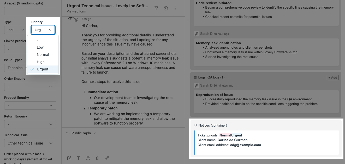
Notices
The Notice feature serves as a versatile tool, offering a range of functionalities to enhance communication and alert mechanisms for agents.
Notices - Features
Discover the diverse capabilities and functionalities of notices, including dynamic content, conditional visibility, and interactive elements.
Dynamic alerts
Function as read-only objects designed to dynamically alert and inform agents about noteworthy aspects of a ticket.
Centralized communication
Act as a versatile container, centralizing all individual notice objects in one location. Alternatively, organize multiple notices to efficiently group related notice objects.
Prominent highlighting
Craft notices to deliver prominent alerts when a ticket possesses a specific tag or field value. Utilize expansive styling options, including large text and vibrant colors, for immediate attention.
Advanced customization
Support placeholders and Liquid markup for dynamic content, enabling the creation of highly customized and context-aware notifications tailored to agents' needs. These features transform notices into calculated fields, where content is automatically adjusted based on variables within the ticket, akin to using formulas in spreadsheet applications.
Show notice in popup modal
If you'd like to ensure an important notice grabs the agent’s attention immediately, you can display it in a popup modal that instantly appears when the ticket is opened.
Notices - Link modifiers
The links within a notice can be enhanced using available link modifiers.
#insert
Upon clicking the link, the enclosed text seamlessly integrates into the comment editor, positioning itself below any pre-existing text, essentially appending the content encapsulated by the link.
#comment
Performs akin to #insert, with the distinction of entirely replacing any existing text within the comment editor—effectively overwriting the content currently present in the editor.
#macro:123456
Executes the macro with the designated ID, such as 123456. Obtain the macro ID number from the address bar while in the process of editing the macro.
Notices - Add as a new object
Learn how to integrate notices as a new object in Sticky Notes.
1. In this example, in the Existing ticket sidebar location, click Add and choose Notices. Alternatively, you have the option to include the object in a different location.
2. Notices function as a container where individual notice objects are added. Simply click Add to include a singular notice.
3. Assign a unique title to this notice for streamlined identification within the settings menu. Please note that this title is for internal use only and will not be visible to agents.
Note: The next steps show an example of how a notice can be utilized.
4. In the notice settings page, choose Show notice when conditions are met and specify tags in the Contains ALL... and/or Contains ANY... fields.
5. Input the suggested text into the Notice text field. Highlight the text you intend to make clickable and transform it into a link by utilizing the link icon. The displayed link shown in the example below, upon clicking, will execute the macro with ID 123456.
6. Feel free to generate a new notice for each distinct condition you deem necessary. In the example below, there are three lines of suggested text within a single notice, yet you may opt for a singular suggestion per notice based on your specific requirements.
7. You can also leverage Liquid markup within the Notice text field, allowing you to incorporate conditions seamlessly into the content of the notice, effectively using it as a calculated field.
8. Another option is to utilize placeholders, similar to their use in macros. For instance, you can seamlessly insert the requester's name into the suggested text.
9. Remember to click Save to preserve all the settings you've configured.
Notices (container) - Customize preferences
Customize your preferences for the container to align with your workflow, including options for display, formatting, and behavior.
Enable
Toggle this option on to activate the object and allow it to appear on the app. When enabled, the object becomes active and is visible within the application interface. This feature is used to control the presence of the object in the app, providing flexibility in managing which objects are actively displayed.
By utilizing this feature, you have the ability to control the visibility and functionality of the object within the app. This can be particularly useful for managing and organizing content, ensuring that only relevant and active objects are displayed to users.
Notices list
Here you can manage all notices within the app. You can add new notices or rearrange existing ones by dragging and dropping them into your preferred order. Each notice can be tailored with dynamic content, such as satisfaction ratings, to provide context-specific information to users as they navigate the app.
Label
Enter a custom label for the notices section in the app's interface. The default label provided is Notices, but you can change it to match your specific context or preference.
Max columns width
This feature allows you to customize the layout of objects on the screen. This setting is particularly useful for managing the way notes are displayed when the Sticky Notes app window is resized or viewed on different screen sizes.
Auto
The app intelligently adjusts the number of columns. Most field types will display in a single column for a compact view. However, fields that typically contain more content—such as multi-line fields, notices, logged notes, and pinned comments—will automatically span two columns. Additionally, any text field containing more than 30 characters will also expand to take up two columns, allowing for easier reading of longer entries.
1, 2, 3, or 4
Manually set the app to display your notes in 1, 2, 3, or 4 columns. This is useful when you want a consistent, fixed-column layout regardless of window size.
Full width (All columns)
This option allows your notes to expand across the entire width of the app window. The notes will adjust in size to fill the space, which can be useful if you prefer larger notes or a more fluid layout when you resize the app window.
If you're using a larger display or have many notes, 'Full Width (All Columns)' can help maximize your space. For smaller displays or for a more focused view of your notes, selecting a fixed number of columns may be more beneficial. Remember, you can change this setting at any time to adapt to your current workflow needs or screen setup.
Note: When the sidebar is being resized, the columns will increase in width until they get to the point where another column can be added.
Description tooltip
Craft a tooltip description that will appear when an agent hovers over the information icon next to the Notice label. Use placeholders and Liquid markup to include dynamic content relevant to the field's purpose. This tooltip provides agents with immediate guidance or additional context for the field in question.
Label style
Personalize the visual styling of your notice labels with options for text color, background color, font size, and toggles for bold and italic formatting. Tailor these settings to match your application's design and enhance readability.
Notices (individual) - Customize preferences
Tailor your preferences for individual notices to align with your workflow, including options for display, formatting, and behavior.
Name
Assign a distinctive name to this notice for easy identification and organization within your list of notices. The name is for internal reference only and will not be displayed to agents; it serves solely to help you locate and manage this notice within the settings.
Enable
Slide this toggle to Enable to activate this individual notice within the notice container.
Show/hide notice
Select the criteria for displaying the notice within the application.
Always show notice (if notice text exists)
The notice will be displayed as long as it contains text.
Show notice when conditions are met
The notice will be shown only when specific predefined conditions are satisfied.
Hide notice when conditions are met
The notice will be hidden when certain conditions are met, which allows for contextual visibility of notices.
These settings provide flexibility in how and when notices are presented to users, ensuring that relevant information is highlighted as needed.
Set specific parameters to control when a notice should be displayed or hidden within the system. These conditions allow for tailored visibility, ensuring that notices are relevant and actionable for agents based on their roles, group associations, ticket forms, and other defined criteria.
Agent is in ANY of these role(s)
You can enter one or more roles here. The notice will be shown or hidden if the current agent fulfills ANY of the roles specified.
Agent is in ALL of these group(s)
Here, you enter one or more groups. For the notice to be shown or hidden, the current agent must be in ALL of the groups listed.
Agent is in ANY of these group(s)
Similar to roles, you can specify multiple groups. The notice will be shown or hidden if the agent is in ANY of the groups listed.
Is ANY of these brand(s)
If your system supports multiple brands, you can specify which ones apply here.
Note: This condition option only appears when using multiple brands within the system. The option will not appear if only a single brand is configured.
Is ANY of these ticket form(s)
This condition applies to ticket forms. The notice will be shown or hidden if any of the ticket forms listed are associated with the current ticket.
Note: This condition option only appears when utilizing multiple forms. The option will not appear if only a single form is in use.
Group assignment
While most field visibility conditions are consistent across all locations, the condition related to group assignment varies based on the sidebar. Below is the breakdown of how this condition should be set depending on the sidebar you are configuring
Is assigned to ANY of these group(s) - New ticket sidebar or Ticket sidebar - Show or hide notice if the ticket is assigned to any of the specified groups, providing group-specific information necessary for ticket resolution.
Is in any of these group(s) - User sidebar - Show or hide notice if the user is in any of the specified groups, providing group-specific information necessary for ticket resolution. This evaluates the group membership based on the group ID(s) associated with the user profile being viewed.
Is in any of these group(s) - Organization sidebar - Show or hide notice if the user's organization is associated with any of the specified groups, providing group-specific information necessary for ticket resolution. This condition uses the group ID(s) associated with the organization to which the user belongs.
Contains ALL of these tag(s)
Tags are often used to categorize tickets based on content or required action. The notice will be shown or hidden if the ticket contains ALL the tags specified.
Contains ANY of these tag(s)
This is a less strict condition than the previous one. The notice will be shown or hidden if the ticket contains ANY of the tags listed.
These conditions are typically used to make sure that the right notices and warnings are shown to the right agents, based on their role, group membership, the type of ticket they're viewing, or the brands they're dealing with. This helps in customizing the user interface and user experience to be relevant to the user's context and permissions.
Show notice in modal
If you'd like to ensure an important notice grabs the agent’s attention immediately, you can display it in a popup modal when the ticket is opened.
Show notice in modal
Toggle this on to activate the popup modal. The notice text will appear in a centered overlay that requires agent acknowledgment before proceeding.Also show notice in sidebar
Optional- toggle this on if you want the same notice to remain visible in the ticket sidebar after the modal is closed.-
Show when?
Choose when the popup modal should appear:When ticket is first viewed – The modal appears once when the agent first opens the ticket.
Every time ticket is viewed – The modal shows every time the agent opens the ticket, which is useful for high-priority or time-sensitive reminders.
Confirmation button text
Enter custom text for the button agents will click to close the modal (e.g. “Got it”, “Understood”).
If left blank, the default label OK will be used.-
Extra confirmation action
Choose whether to include an additional step before agents can close the modal:
None – The modal can be dismissed by clicking the confirmation button.
Checkbox – Requires agents to tick a checkbox (e.g. “I understand”) before the confirmation button becomes active. This can be useful for emphasizing acknowledgment of critical info.
This is a useful alternative if agents often miss notices in the sidebar- especially when the Sticky Notes app is collapsed. Modals are always shown in full view, helping ensure your message is seen.
Notice text
Type in the content for the notice in this field, utilizing rich text formatting options to style your message. You can also use placeholders and Liquid markup to dynamically insert data, making your notice more informative and relevant to the context in which it appears. Don’t forget to check the available placeholders to see what dynamic content you can include in your notice.
Description tooltip
Craft a tooltip description that will appear when an agent hovers over the information icon next to a field label. Use placeholders and Liquid markup to include dynamic content relevant to the field's purpose. This tooltip provides agents with immediate guidance or additional context for the field in question.
Description above
Input the text that you wish to display above the field in the app interface. This description can be formatted with rich text options and can include dynamic content through placeholders and Liquid markup, offering a guide or additional context for the users interacting with the field.
Description below
Enter any additional information or instructions in this field that you want to appear below the alert text. This area can provide further clarification or details for your agents, enhancing their understanding or guiding their actions with respect to the alert. You can format this text using the rich text editor to make it more engaging and use HTML for advanced styling if required.
Field style
Customize the notice field's appearance.
Text color
Choose the color for your field's text to improve visibility or align with your branding.
Background color
Select a background color to enhance contrast or complement your design scheme.
Font size
Set the size of the text from a range of options for better readability.
Bold
Make the text bold to draw attention or denote importance.
Italic
Italicize the text for emphasis or stylistic preference.
These settings allow you to tailor the look and feel of the fields within your application for a more personalized and user-friendly interface.
Force show app tray when not empty
Enable this feature to ensure the app tray remains visible whenever it contains items, even if the tray is typically collapsed or closed on the screen. This function helps in maintaining awareness of active elements within the app tray.
Show changes
Set preferences for how updates to fields that affect a notice are displayed.
Yes, show changes with old and new value
When a field changes, the notice will display both the previous value (with a strikethrough) and the new updated value.
No, only show new value
Only the updated value will be shown without reference to the previous value.
This setting is particularly useful when using placeholders or Liquid markup, as it visually represents the changes directly within the notice.
Notices - Modify preferences
To modify previously configured preferences for notices, simply locate the container in the Objects in ticket sidebar list, or whichever location you previously chose for the object. A single click on the object will reveal the preferences panel.
Proceed to make any required adjustments, and don't forget to save your changes by clicking Save when you're finished.
Buttons
Buttons are designed for displaying actionable buttons. Each button can be associated with a Zendesk macro or an external link, offering enhanced flexibility for agent actions.
Buttons - Features
Buttons possess distinctive features that set them apart from other objects.
Multifunctionality
Each button can trigger a specific Zendesk macro and open a designated URL in a new browser tab simultaneously.
Macro execution
The Macro setting retains visibility, allowing users to select and execute a Zendesk macro.
Open URL setting
A new setting labeled Open URL is introduced under the Macro setting, which is a text field where users can enter a URL.
Organized container
The feature streamlines the organization of all button objects by curating multiple buttons in one location, grouping together related individual button objects for enhanced efficiency.
These updates provide users with the capability to seamlessly integrate both macro executions and external links within a single button, offering a more dynamic and interactive experience within Zendesk tickets.
Note: While the Macro setting is no longer marked as required, it is essential that either the Macro or Open URL setting has a value. If neither has a value, the form cannot be saved.
Buttons - Add as a new object
Learn how to integrate buttons as a new object in Sticky Notes.
1. In this example, in the Existing ticket sidebar location, click Add and choose Buttons. Alternatively, you have the option to include the object in a different location.
2. Set your main preferences and click Add to create individual buttons.
Buttons (container) - Customize preferences
Tailor your preferences for the button container to match your workflow, including options for display, formatting, and behavior.
Enable
Toggle this switch to Enable to activate the Buttons container within Sticky Notes. When this is turned on, the feature becomes available for use.
Label
Type in a custom label for the button container in the app's user interface. You can use placeholders and Liquid markup in this field to dynamically generate the label based on certain conditions or ticket properties. This label will help users identify the function or purpose of the buttons within the container.
Max columns width
This feature allows you to customize the layout of objects on the screen. This setting is particularly useful for managing the way notes are displayed when the Sticky Notes app window is resized or viewed on different screen sizes.
Auto
The app intelligently adjusts the number of columns. Most field types will display in a single column for a compact view. However, fields that typically contain more content—such as multi-line fields, notices, logged notes, and pinned comments—will automatically span two columns. Additionally, any text field containing more than 30 characters will also expand to take up two columns, allowing for easier reading of longer entries.
1, 2, 3, or 4
Manually set the app to display your notes in 1, 2, 3, or 4 columns. This is useful when you want a consistent, fixed-column layout regardless of window size.
Full width (All columns)
This option allows your notes to expand across the entire width of the app window. The notes will adjust in size to fill the space, which can be useful if you prefer larger notes or a more fluid layout when you resize the app window.
If you're using a larger display or have many notes, 'Full Width (All Columns)' can help maximize your space. For smaller displays or for a more focused view of your notes, selecting a fixed number of columns may be more beneficial. Remember, you can change this setting at any time to adapt to your current workflow needs or screen setup.
Note: When the sidebar is being resized, the columns will increase in width until they get to the point where another column can be added.
Label style
Customize the visual style of your label to match your app's design and improve user interface readability.
Text color
Choose a text color that complements your design and ensures the label is readable against the background.
Background color
Select a background color to highlight your label and make it stand out or blend in with your app's theme.
Font size
Adjust the font size to ensure that your labels are easily readable; options range from small to large.
Bold
Enable bold formatting to make your labels more prominent.
Italic
Apply italic styling for a subtle emphasis or to differentiate certain labels from others.
These style settings provide the tools you need to ensure that the labels in your app are both aesthetically pleasing and functionally clear.
Buttons
This section allows for the configuration and organization of shortcut buttons that facilitate quick access to common tasks or functions such as escalating to Support - Tier 1, Support - Tier 2, Sales and Billing. You can add new buttons or edit the existing ones to streamline your team's workflow. Additionally, the order of the buttons can be customized to match the frequency of use or importance by dragging and dropping them into the desired sequence.
Buttons (individual) - Customize preferences
Tailor your preferences for individual buttons to match your workflow, including options for display, formatting, and behavior.
Enable
Toggle this switch to Enable to activate the individual button within the container. When this is turned on, the feature becomes available for use.
Macro
Select a macro to be executed when the corresponding button is clicked. This action allows for quick and automated execution of repetitive tasks, streamlining your workflow.
You can manage and assign different macros to different buttons as needed within the Zendesk Admin Center. Read more about macros in Zendesk - Macros resources.
Open URL
Enter the URL you wish to be opened in a new browser tab when the button is clicked. This field can dynamically generate URLs based on specific ticket information using placeholders and Liquid markup, allowing for a customized and relevant experience for each user action.
Label
Input a label for the button that will be displayed within the app. You can use placeholders and Liquid markup for dynamic labeling based on ticket data or user context, making the label informative and relevant to the current user interactions.
Show/hide button
Determine the visibility of the button in the app with these settings.
Always show button
The button will be permanently visible, regardless of any conditions.
Show button when conditions are met
The button will only be visible when certain predefined conditions are satisfied.
Hide button when conditions are met
The button will be hidden from view when certain predefined conditions are met.
This provides flexibility in how interactive elements are displayed to the user, depending on the context of their actions or ticket status.
Manage when and how buttons are shown by defining specific conditions related to the ticket's attributes and the agent's context.
Agent is in ANY of these role(s)
Specify roles to determine if the button should be visible based on the current agent's role. If the agent fulfills any of the designated roles, the condition is met.
Agent is in ALL of these group(s)
List groups to make the button visible only when the agent is a member of all specified groups.
Agent is in ANY of these group(s)
Enter groups to allow button visibility if the agent is in any of the listed groups.
Is ANY of these brand(s)
Make the button visible only if the ticket is associated with any of the selected brands.
Note: This condition option only appears when using multiple brands within the system. The option will not appear if only a single brand is configured.
Is ANY of these ticket form(s)
Display the button when the ticket includes any of the specified ticket forms.
Note: This condition option only appears when utilizing multiple forms. The option will not appear if only a single form is in use.
Is assigned to ANY of these group(s)
Specify groups to set the condition for visibility. If any of the groups added is assigned to the current ticket, the condition is met.
Contains ALL of these tag(s)
Show the button if every one of the entered tags is present in the ticket.
Contains ANY of these tag(s)
The button becomes visible if any of the provided tags are attached to the ticket.
These conditions enable a dynamic and context-sensitive interface, presenting buttons that are pertinent to the current support scenario.
Description tooltip
Provide supplementary information in this tooltip that will be displayed when an agent hovers over the info icon next to a field label. You can format this text using the rich text editor and incorporate placeholders and Liquid markup for dynamic content specific to each agent's interaction with the field.
Description above
Compose a brief description to be displayed above the respective field, providing context or instructions. This can be formatted for clarity and emphasis, and may include dynamic data through placeholders and Liquid markup, creating a tailored experience for each user.
Description below
Insert additional details or explanatory text in this field to be displayed below the corresponding field within the application. This text can be enhanced with rich text formatting for better presentation and can include dynamic elements through placeholders and Liquid markup, offering specific guidance or information based on the current context or content of the field.
Confirmation require
Enable this option to prompt users for confirmation before proceeding with the action assigned to the button. This serves as a safeguard against unintentional changes or actions.
Confirmation message
Write the confirmation message that will appear when users are prompted to verify their action. You can use rich text formatting to highlight important information, and incorporate dynamic content through placeholders and Liquid markup to make the confirmation message specific to the action being confirmed.
Field style
Customize the button field's appearance.
Text color
Choose the color for your field's text to improve visibility or align with your branding.
Background color
Select a background color to enhance contrast or complement your design scheme.
Font size
Set the size of the text from a range of options for better readability.
Bold
Make the text bold to draw attention or denote importance.
Italic
Italicize the text for emphasis or stylistic preference.
These settings allow you to tailor the look and feel of the fields for a more personalized and user-friendly interface.
Modify preferences
To modify previously configured preferences for Buttons, simply locate the container in the Objects in ticket sidebar list, or whichever location you previously chose for the object. A single click on the object will reveal the preferences panel.
Proceed to make any required adjustments, and don't forget to save your changes by clicking Save when you're finished.
Object management
Efficiently handle object configurations as needed.
Clone an object
The cloning feature provides a convenient way to replicate and relocate items within the app.
Efficiency
Save time by duplicating objects instead of recreating them from scratch.
Consistency
Ensure uniformity by copying objects with standardized settings.
Flexibility
Easily move objects between locations to optimize organization.
1. Select the object: Identify the object you wish to clone from the list but do not click the box.
2. Access the Clone option: Click the three vertical dots (ellipsis) icon to the right of the object's name. This will open a menu of additional actions.
3. Select Clone: Within the dropdown menu, locate and select the Clone option. This action will initiate the cloning process for the selected object.
4. Select new location: Select the location to clone the object to. Note that you cannot clone the object to the same location where it currently resides, so that location will not be shown.
5. Save changes: Click Clone to proceed and save the changes, or click Cancel if you've changed your mind.
6. Check the new location: Confirm that the object now appears in the location you selected for cloning.
Disable an object
Disabling an object temporarily removes it from active use without deleting it.
1. Select the object: Identify the object you wish to disable from the list but do not click the box.
2. Access the Disable option: Click the three vertical dots (ellipsis) icon to the right of the object's name. This will open a menu of additional actions.
3. Select Disable: Within the dropdown menu, locate and select the Disable option. This action will initiate the disabling process for the selected object.
4. Save changes: Click Yes to proceed and save the changes, or click No if you've changed your mind.
5. Check the change: Confirm that the object now shows as disabled on the list. This means it will no longer appear on the app for users.
Enable an object
You can enable an object after disabling it temporarily from active use without deleting.
1. Select the object: Identify the disabled object you wish to enable from the list but do not click the box.
2. Access the Enable option: Click the three vertical dots (ellipsis) icon to the right of the object's name. This will open a menu of additional actions.
3. Select Enable: Within the dropdown menu, locate and select the Enable option. This action will initiate the enabling process for the selected object.
4. Save changes: Click Yes to proceed and save the changes, or click No if you've changed your mind.
5. Check the change: Confirm that the object no longer shows as disabled on the list. This means it is now back in active use and will appear again on the app.
Delete an object
You can delete an object to remove it permanently from the app.
1. Select the object: Identify the disabled object you wish to enable from the list but do not click the box.
2. Access the Delete option: Click the three vertical dots (ellipsis) icon to the right of the object's name. This will open a menu of additional actions.
3. Select Delete: Within the dropdown menu, locate and select the Delete option. This action will initiate the deletion process for the selected object.
4. Save changes: Click Yes to proceed and save the changes, or click No if you've changed your mind.
5. Check the change: Confirm that the object no longer appears on the list. This means it has now been permanently deleted from the app.
Backup & Restore
Maintain the safety and integrity of your Sticky Notes configuration with the Backup & Restore feature. This essential utility ensures that your settings are preserved and can be quickly reinstated in case of unintended changes or data loss.
1. Click More options on Sticky Notes.
2. Select App settings.
3. Click Backup & Restore.
4. You can now access both the Backup and Restore sections.
Backup
Create a secure copy of your current configuration by exporting all settings as a JSON file. This simple process involves:
1. Navigate to the Backup section within the panel.
2. Highlight and copy the entire block of JSON code, which encapsulates your app's configuration.
3. Paste the copied JSON data into a code editor or JSON viewer. This step is crucial for maintaining the integrity of the data, as these tools are designed to handle JSON formatting and will prevent the introduction of unwanted characters or symbols.
Note: It's recommended to perform backups regularly, especially before making significant changes to your Sticky Notes configuration. When handling backups, always ensure that you save the JSON data in a secure place. Consider using version control for your backups if you make frequent updates to your configuration. Be mindful of the potential for inadvertently sharing sensitive configuration data. Always use appropriate tools like a code editor or JSON viewer when editing or backing up your JSON string to avoid any formatting issues.
Restore
In the event that you need to revert to a previously saved configuration, or if there has been a corruption in the current settings, the Restore function is your go-to solution:
1. Head over to the Restore section within the panel.
2. In the provided text field, paste the JSON configuration that you have backed up using a code editor or JSON viewer.
3. Click Restore to overwrite the current settings with the ones from your backup.
Using the Restore function reinstates your Sticky Notes environment to the exact state captured in the backup, allowing for a seamless recovery process.
Using images
Integrating images into Sticky Notes effectively can make your communications clearer and more engaging. Whether you're inserting small images directly or linking to larger images hosted externally, this guide will help you manage images seamlessly.
Benefits of using images in Sticky Notes:
- Visual clarity: Images can break down complex instructions or clarify details, making it easier for your team to grasp processes and tasks.
- Increased engagement: Visuals capture attention and can keep your team focused and interested in the content.
- Improved communication: An image can often convey what words cannot, which is especially useful for visualizing steps in a procedure or highlighting specific issues.
- Professional look: Well-chosen images can elevate the look of your notes, making them appear more organized and meticulously prepared, which can enhance team perception and effectiveness.
Direct insertion
This method is ideal for smaller images within the 65KB size limit imposed by Zendesk fields. Directly add these images to your notes through the Rich Text Editor (RTE), where they become a permanent part of the content.
How to directly insert images:
- For Windows and Mac, use tools like Snipping Tool or screenshot shortcuts to capture and copy images directly to the clipboard.
- Paste these images directly into the RTE of Sticky Notes.
External embedding
This method is best for larger images or when you prefer not to store images directly within Sticky Notes. This involves linking to images hosted externally—like on the Zendesk Help Center, ticket attachments, or other web-hosted platforms.
How to embed images externally:
- Use the Zendesk Help Center to host images, linking them within your notes.
- Attach images to tickets marked as "On-hold" to ensure they are not deleted and link these in your notes.
- For images on external sites, ensure they are accessible to your team and link them similarly.
For step-by-step details on each method, refer to our how-to article: Options for handling images in Sticky Notes.
Best practices
Unlock the full potential of Sticky Notes and make your Zendesk experience smoother and more collaborative with these practical tips. Whether you're just starting out or looking to polish your skills, these strategies are designed to boost efficiency and make teamwork more effective.
For admins
Simplify your setup
Think about everyone who uses Sticky Notes—support agents, team leaders, admins, developers, and QA folks. Set things up with their specific needs in mind.
Get creative with Zendesk fields
Use these fields to keep important info handy and organized, whether it's about tickets, users, or entire organizations.
Keep names clear
Use consistent names for notes, buttons, and alerts to avoid any confusion and make things easy to find.
Strategic placement
Position elements like alerts and buttons where they'll be most useful to agents.
Clone and conquer
Save time and ensure uniformity by cloning objects. This helps maintain consistency across your system.
Design with purpose
Aim for a clean and attractive interface. Tinker with labels and styles to find the best look.
Check your settings often
Regularly revisit your settings to make sure Sticky Notes is evolving along with your team's needs.
Encourage feedback
Ask for input from your team to keep improving and make Sticky Notes even better.
Stay updated
Keep an eye on new updates and features for Sticky Notes, and think about how they might enhance your setup.
For users
Log notes efficiently
Use logged notes to keep a detailed and dated record of all ticket interactions.
Master pinned comments
Learn how to use pinned comments effectively to boost visibility and cooperation among team members.
Be consistent with terms
Stick to the same terminology throughout your notes to keep communication clear.
Use visuals effectively
Add screenshots or images to clarify steps or highlight important points - pictures can make instructions much easier to follow. Integrate images either by direct insertion for smaller images or through external embedding for larger visuals.
Incorporate interactive elements
Whenever you can, add videos or links to demos. They can make complex processes much easier to understand.
FAQs
Q1: What is Sticky Notes, and what does it offer within Zendesk?
A: Sticky Notes is an advanced tool designed to enhance ticket management within Zendesk, offering features like logged notes, pinned comments, smart notices, and customizable fields.
Q2: How can I configure Sticky Notes for optimal functionality?
A: The Quick Start guide simplifies the configuration process, allowing users to tailor the Sticky Notes experience to their specific needs.
Q3: What are the key features of logged notes in Sticky Notes?
A: Logged notes allow users to create timestamped and agent-attributed notes with customizable editing permissions, providing a powerful tool for tracking and logging.
Q4: How can I create pinned comments in Sticky Notes?
A: Pinned comments are created by adding a custom ticket field of the type Multi-line in Zendesk's Admin Center and configuring the display in the Existing ticket sidebar location.
Q5: How do I use Zendesk fields in Sticky Notes?
A: Zendesk fields can be used to store notes and serve as a dynamic and visible means of adding essential information to tickets, users, or organizations within Zendesk.
Q6: How do I display a user field on all tickets created by that user?
A: To display a specific user field on all tickets created by the same user, follow these instructions:
-
-
- Navigate to App settings.
- Under the Ticket sidebar location, click Add and select Zendesk field.
- Use the dropdown menu under Ticket / User / Organization to choose User field (Requester) for the field the object will appear in.
- A dropdown menu for Field will appear and you can then select the desired user field.
-
This process will ensure the selected user field is displayed on all tickets for any user. If you wish to display additional user fields on the tickets, simply repeat the steps above for each field.
Additionally, it's important to note that you can configure these user fields to be either editable or read-only and set them to be shown or hidden based on specific conditions. This flexibility allows you to tailor the ticket viewing experience to meet your organizational needs and workflows.
You can read more about setting up your preferences and configuring field visibility and editability in at Zendesk fields - Customize preferences.
Q7: What is the notice feature in Sticky Notes?
A: The notice feature serves as a versatile tool within Zendesk, offering dynamic alerts, centralized communication, prominent highlighting, and advanced customization for efficient communication and alert mechanisms.
Q8: How can I enhance links within a notice?
A: Links within a notice can be enhanced using link modifiers, including #insert, #comment, and #macro, allowing for seamless integration and dynamic content.
Q9: How do I create notices in Sticky Notes?
A: Notices are created by selecting the Notices object in the Existing ticket sidebar or New ticket sidebar location, adding individual notice objects, and specifying conditions, text, and dynamic content.
Q10: What are the features of buttons in Sticky Notes?
A: Buttons in Sticky Notes are designed for displaying actionable buttons associated with Zendesk macros or external links, or both if necessary, offering enhanced flexibility for agent actions.
Q11: How can I create buttons in Sticky Notes?
A: Buttons are created by selecting the Buttons object in the Existing ticket sidebar or New ticket sidebar location, setting preferences, and adding individual buttons associated with Zendesk macros or external links.
Q12: What object management options are available in Sticky Notes?
A: Object management options allow users to personalize the visual appearance, enable or disable objects, clone items for efficiency, and modify preferences for precise control over the app's functionality.
Q13: How can I add objects and customize preferences in Sticky Notes?
A: Users can add objects via Quick Start, customize object preferences such as visibility, location, and display conditions, and save changes to ensure the desired configuration.
Q14: Why isn't Sticky Notes available on mobile devices like smartphones and tablets?
A: Unfortunately, the lack of app support for mobile devices is a limitation imposed by Zendesk. As of now, Sticky Notes is specifically designed for desktop environments within Zendesk, and mobile functionality is not supported. We recommend accessing Sticky Notes on a supported desktop browser for the optimal user experience.
Q15: How can I stay informed about future updates and enhancements to Sticky Notes?
A: Stay updated by regularly checking for new versions of Sticky Notes and reviewing release notes. Additionally, monitor Zendesk's official channels and support resources for announcements regarding app enhancements.
Q16: What should I do if I encounter issues or have questions about Sticky Notes?
A: Refer back to this comprehensive user guide for solutions or seek assistance from Zendesk's support resources. Our support team is available to help address any questions or challenges you may encounter.
Conclusion
Congratulations on completing the Sticky Notes user guide! We're glad you've taken the time to dive deep into what Sticky Notes can do within Zendesk. Our goal is to help you make the most of every ticket and every interaction, making collaboration smoother and communication clearer.
Key takeaways
For everyone
Sticky Notes is designed with every role in mind - from front-line support agents to developers and QA testers. Discover tools and features that cater specifically to your needs.
Better visibility and teamwork
Enhance teamwork with features like pinned comments and smart notices, which keep crucial information accessible, promoting effective collaboration across the board.
Easy customization
Our Quick Start configuration allows you to tailor Sticky Notes to your team’s requirements, turning every ticket into an opportunity to improve efficiency.
Adaptable display options
Customize where Sticky Notes appear in Zendesk to best fit your team’s workflow, ensuring that important notes are always just a glance away.
Flexible tools
Dive into a variety of customizable options - modify notes, buttons, and fields to match your team’s specific processes.
Personalize your experience
Explore advanced settings to adjust the visual style, manage features, replicate objects for streamlined setup, and continually refine your workspace.
Next steps
Experiment and improve
Try out different configurations of Sticky Notes to discover what best enhances your team's performance.
Engage with visuals
Leverage the visual and interactive elements available in Sticky Notes to enrich the user experience, making information more accessible and engaging.
Keep up-to-date
Stay informed about the latest updates and features of Sticky Notes to maximize its evolving capabilities in your workflow.
Seek support when needed
If you have questions or run into challenges, don’t hesitate to revisit this guide or reach out to Zendesk’s support resources. Our dedicated support team is also always ready to assist you.
Thank you for choosing Sticky Notes to enhance your Zendesk experience. Happy note-taking!
Comments